Sign up for our new fortnightly non-profit newsletter

The Idea Bureau

Introduction

Bringing an existing intelligence consultancy up to date with a custom-built portal to improve the client experience and a slick brand redesign to help them stand out above the crowd.

ODDIN is a protective and corporate intelligence firm, based in the UK, that provides a bespoke consultancy service to multinational companies, high net-worth individuals and government departments. They’re leaders in open-source intelligence (OSINT) and deliver highly insightful research, analysis and intelligence via accurate and up to date techniques, tools and knowledge.

To secure their clients’ global assets, they exploit open source data by harnessing the latest intelligence gathering and analytical methodologies. There are three main industries they work with: financial institutions and accountancy firms, law firms, and companies within the oil and gas industry.

The Problem

Previously known as Urso, ODDIN’s former way of working was no longer fit for purpose. They approached us to create an app that would serve as an online portal for both their clients and auditors, making their due diligence report creation much more simple and efficient. Prior to engaging with The Idea Bureau, they’d been building reports in word-processing software. This was an incredibly time consuming and manual process, and the format didn’t demonstrate the company’s branding to recipients.

As such, they also required assistance in creating a new brand identity, complete with an updated marketing website that would attract a particular audience. The website would be pivotal in promoting the app and ODDIN’s much more streamlined way of working to potential clients.

“The Due Diligence Platform was just something flittering around in my brain for a few years and the fact you’ve managed to take my doodles and create precisely what I was after is very impressive.”

ODDIN Director

Our Solution

We collaborated with ODDIN to convert the process of due diligence checks into a digital format. This began by holding two discovery workshops. The first of these workshops allowed us to determine the look and feel the client wanted for the branding, and to start putting together the marketing website. To do this, we undertook much research, created wireframes of the initial designs, and then presented this to the client for feedback.

Working alongside a freelance Front-End Developer, Ada, we created a one-page site that features a ‘subscription plan’ structure, a comprehensive overview of the services ODDIN provides, and a contact form. As well as the marketing site, Ada was key in helping create the front-end components of the online portal.

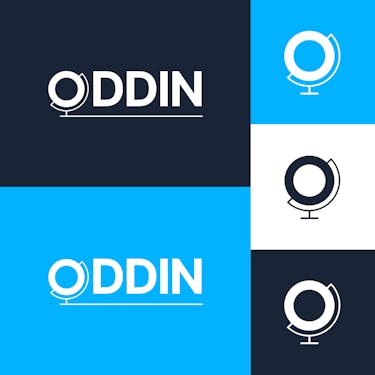
“To accompany the company’s new direction we decided we needed a complete rebrand. Having no experience in such matters, we relied entirely on The Idea Bureau taking us through each of the stages of finding our business identity and representing this in our new brand. We’re particularly happy with the new logo designed which is minimalist and unique, allowing us to use it as a standalone company identifier on a range of products.”

Client:
ODDIN
Project Type:
Branding, Website, Bespoke Application
Link:
https://oddin.co/
Tags:
Website Redesign, App Design, Branding

How the platform works

Having decided upon the branding direction during the initial phase, the process of designing the portal sped up dramatically, as it meant we could use the designs as a launch pad for creating its components. The app has two sides to it: the ‘Admin’ interface and the ‘Customer’ portal.

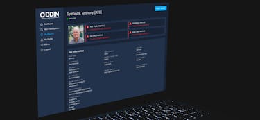
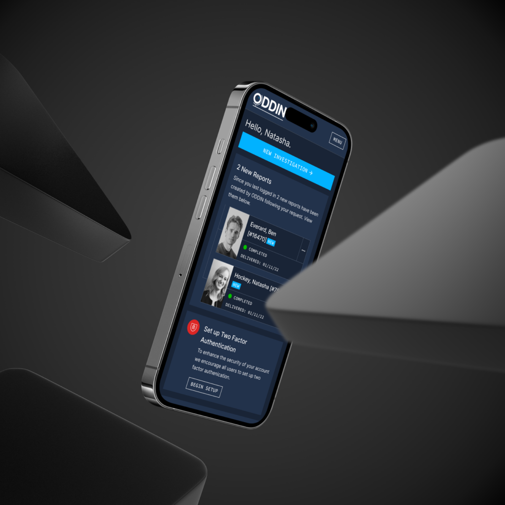
ODDIN’s clients are able to log into their account and input details of a particular subject they wish to request a report for; these details are then passed onto an analyst, who takes the information and builds a profile to be sent to the client once complete.

The platform is primarily built with Laravel, Vue, and Intertia.js. We used Laravel Nova as a foundation for the admin panel, which enables managers and analysts to keep an eye on new investigation requests throughout the entire process. Additionally, we configured Laravel Spark and Stripe to allow customers to subscribe to the service. This enables both clients to manage their subscriptions and administrators to manage their customers directly.

Elevating the design and build process with Storybook

During the build phase, we used Storybook, a front-end tool that allowed us to implement block design and behaviour in isolation before undertaking the main back-end integration phase. While it was a little time consuming in the beginning, this very useful app allowed us to make great progress early on. Storybook gave us the ability to build engaging and robust user interface components with variations that would apply to a number of situations. These components could then be easily built out during the development phase. Using Storybook also meant we could frequently implement tests, which ultimately saved time and potential headaches further along in the project.

The Idea Bureau was able to take our detailed requirements and develop precisely what we were looking for whilst also making key suggestions and improvements to our initial plan.

ODDIN Director

Creating consistency and structure

Introducing data sets – such as dates, locations and relationships – into the online portal gave the reports constraints to work within, and as such, added consistency. We chose Mapbox to give Geographic Information System (GIS) functionality within the report, which assists in providing location-based data. Furthermore, we implemented Statamic to act as the content management system for the marketing side of the project – this allows the client to update their content as necessary.

“The Idea Bureau was able to take our detailed requirements and develop precisely what we were looking for whilst also making key suggestions and improvements to our initial plan. The team were incredibly patient and remained responsive to our, often changing, needs through the whole process.”

Director of ODDIN

Providing a marketing touchstone

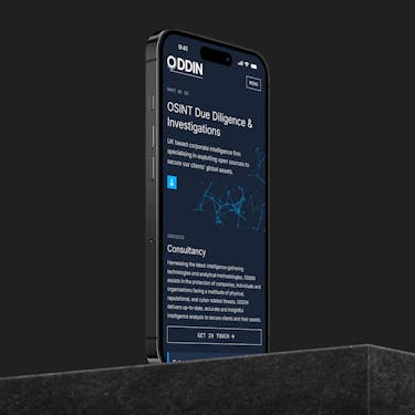
Our new design for the marketing website needed to showcase ODDIN’s sleek new look, as well as providing a point of contact for their potential clients. We feel we’ve been successful in achieving this. Working with a simple one-page layout, the website gives its audience clear and concise information about the company, with straightforward call to action points to enable them to continue their onward journey. The design choices for the online app were inherited from the site design, which kept the branding consistency and increased efficiency in the build process.

Conclusion

We’re really pleased that we’ve helped another organisation bring their client processes to life. We’re keen to see how they’re used in the future, and how we can adapt and push the product forward as we continue to work alongside them.

ODDIN now has a platform dedicated to providing users with due diligence checks, as well as clear executive summaries that make this type of service far more accessible and convenient for its clients.

How can we help you on your next project?

Contact us today
Unlock your digital potential with a bespoke website audit