Component-Driven Development with Storybook

We recently crafted the front-end of an application slightly differently. While constructing a system named Sparrow for the UN, specifically for aiding in the analysis and reporting of global Twitter data; we made extensive use of component-driven development and Storybook. I was keen to take the time today to describe some of the concepts involved, and how it all came together to form a terrific end result!
So, what exactly is Component-Driven Development?
We’re tasked with making interfaces for more users in more contexts using more browsers on more devices with more screen sizes and more capabilities than ever before.
This can be a daunting task, which is the reason there are so many different design systems out there to help us conceptualise how all this logic fits together. The proposed benefits in terms of efficiency, consistency, maintainability and transparency are why these systems are so popular among designers, engineers and managers the world over.
Component-Driven Development is a particularly popular development methodology that anchors the build process around individual “components”.
Using CDD we build UIs from the ground-up. We start at the most minute level, building small components in isolation and defining their relevant states, we combine these components together to assemble more complex components and finally assemble these together to create full and vibrant pages.
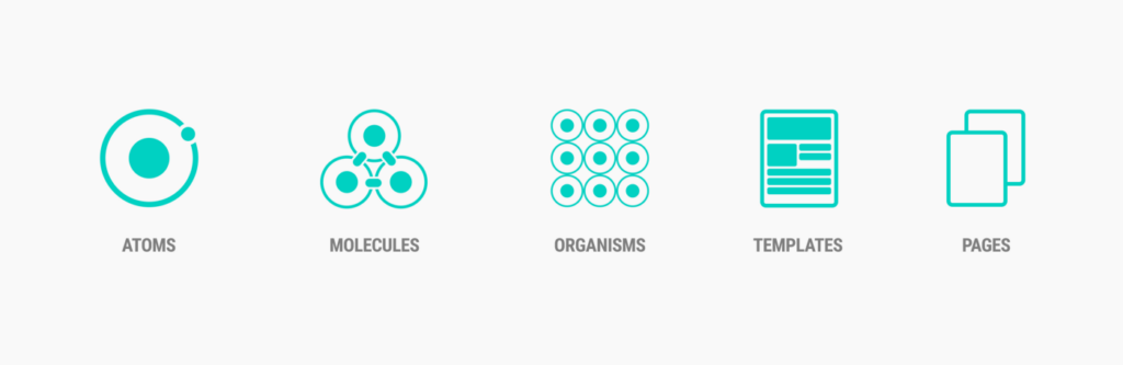
Following this pattern of thinking, on a recent project we took inspiration from Brad Frost’s: “Atomic Design”. Which takes this component based approach a step further. Brad describes each element making up a UI as either an “Atom”, “Molecule”, “Organism”, “Template” or. “Page”. These are the building blocks of every application, atomic units bond together to form molecules, which in turn combine into more complex organisms to ultimately create all matter in our universe.
Enter Storybook…
So what is Storybook? Storybook is an open source tool for building UI components and pages in isolation. Sounds like exactly what we need right! Perfect for streamlining UI development, testing, and even documentation.
Storybook gives us a sandbox to display each component, one at a time, in a fixed series of states, completely decoupled from any of the internal application or business logic. And it even comes in several flavours of implementation, being made for React, Vue, Angular and even straight-up HTML. So flexible!
There are countless benefits to working this way, for us the most obvious was a faster QA process with better results. Storybook provides living, breathing evidence of how each component in a library functions. It allowed other team members and even customers to see exactly how the components look and feel in different scenarios.
Seeing all the states of the component and how it’s behaving in different situations provided valuable feedback early on in the development process, allowing for rapid iteration and the weeding out of unforeseen issues.
..So why not always work this way?
As you might’ve guessed, defining every element within a UI at the atomic level could be overkill, it can take a great deal of time and could just add to the inherent complexity of a project. There are also other systems and concepts out there that could be used to deliver a similar end result.
Ultimately there are countless ways to approach the construction of an app, and also to define its success. Creating applications in this way proved to be is a winning strategy on this project, but it may not always the right choice on another project.
Component-driven development and Storybook are a set of concepts and tools we’ll be revisiting on other projects however, as on a project we’ll share with you in more detail eventually, for a wonderful client, it’s empowered us to create something remarkable!

