Within our design process here at The Idea Bureau we use Figma as our UI tool of choice. It’s an incredibly powerful and collaborative piece of software that has an incredible community behind it. Figma Plugins are created and maintained by this community and we love exploring and testing these new plugins within our process.
We want to share with you a few of our standout favourites that have helped improve our workflows during the design process.
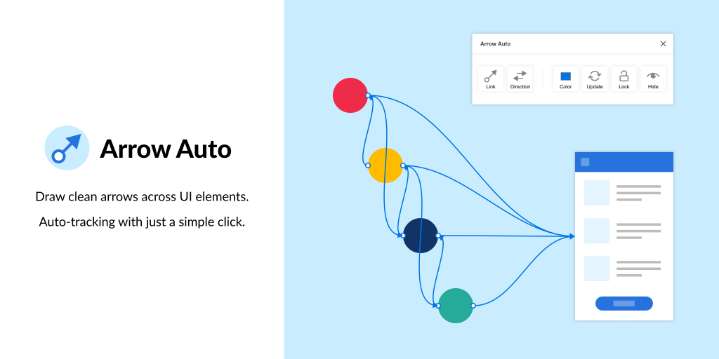
Arrow Auto
Arrow Auto makes it super easy to create user flows within Figma without having to manually draw and link arrows between frames and components. We find this super useful on bigger, more complex projects where there’s more details and paths that users can take.
We’ve recently been using this on the design of a cross-platform healthcare app and it’s been a valuable tool to help bridge that gap between the design and development process.
Remove BG is a simple, yet fantastic plugin that allows you to remove the background of images directly in Figma. Gone are the days where you’d spend time editing this out in Adobe Photoshop. This can now be achieved directly in Figma at the click of a button.
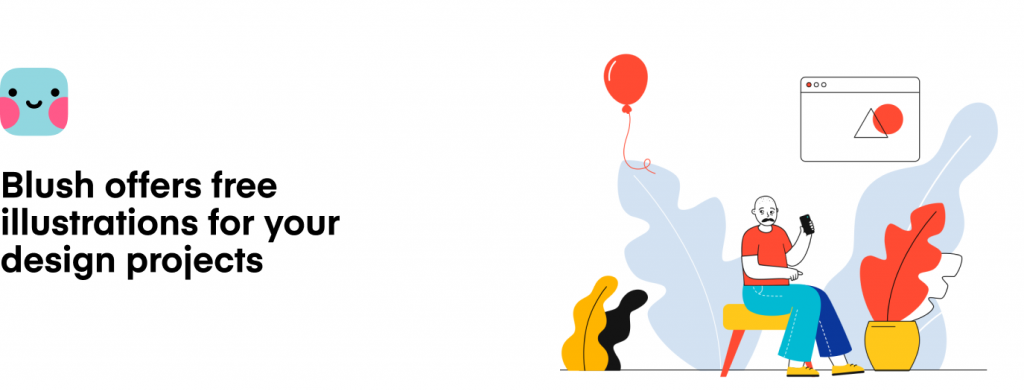
Blush is a new Figma Plugin that we’ve discovered and it allows you to use free illustrations within your designs. There are a number of different designers within this plugin, meaning that there’s a wide variety of illustration styles available.
The Figma Plugin allows you to mix and match components within each illustration set so that you can create your own bespoke combinations that work best for your project.
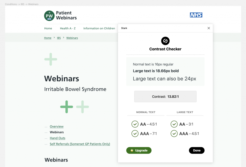
The Stark plugin is a firm favourite amongst a lot of designers as it helps you to ensure that your designs are accessible by providing a contrast checker and colour blind simulator. It’s really easy to use and provides instant feedback letting you know if your colours meet the WCAG guidelines.
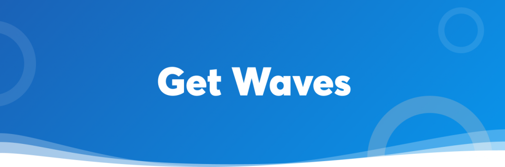
Within our designs we often use shapes to add flourishes to the UI. It can be tricky and take time to create those perfectly smooth shapes that work well and this is where Get Waves comes in. With this plugin you can create SVG wave shapes with whatever amount of curve and complexity you choose, really quickly. As they’re SVG you can also easily tweak them after if needed!
We recently had the privilege of working with the team at Patient Webinars, created by a team of community dietitians in Somerset and in partnership with the NHS, the service uses webinars to improve patient care and increase understanding of diet-related illnesses.
Our task was to replace their WordPress.com prototype with a new, fresh and purposeful website. This was an exciting project to be involved with, and in this blog post, we explore three key pillars to the build and how they improved the development process, aided the client to own their content and delivered a great user experience.
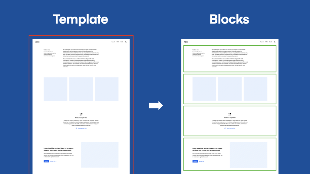
Blocks, a revolution in WordPress development
In December 2018 WordPress version 5 was launched with a brand new editor, Gutenberg, and with it a new approach to WordPress content management, blocks.
Blocks allow us to stop thinking of websites as a series of rigid templates, but instead as a range of individual, discrete and reusable components. This approach offers numerous advantages for both us as developers and our client:
Implementation is focused as blocks are self-contained
Testing and quality assurance on smaller components is quicker and easier
Concise and clear code structure makes maintenance easier
Empowers the client to manage their content in new ways
Makes it easier for the website to adapt as business needs change
Looking back on the build and subsequent launch of the website, it’s clear the value blocks have had, it’s been quicker to build, test and launch, and allows the client to own their content. Value like this will ensure the website is useful for many more years to come.
As usual, we used the wonderful Advanced Custom Fields plugin, a regular for most WordPress developers. However, ACF version 5.8 launched with the ability to register new blocks which made the process quick and efficient, whilst using “Local JSON syncing” to version control field group definitions for easy deployment.
Changing our focus from templates to blocks.
Benefiting from the NHS Digital Service Manual
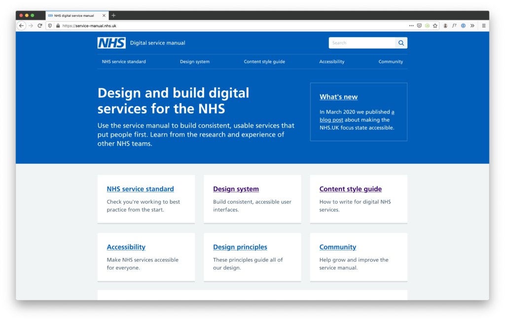
During our initial discussions with the client, it was clear what level of quality we were both aiming for concerning user experience, allowing the webinar and associated content to stand tall on a modest budget was going to be a challenge. We were considering our options with what design approach to take when we discovered the NHS Digital Service Manual.
The NHS Digital Service Manual is a project created to provide “usable services that put people first”. Much like the Government Digital Service, the service manual allows services to be built quickly, on a bed of research aimed at delivering accessible experiences for everyone.
Use the service manual to build consistent, usable services that put people first. Learn from the research and experience of other NHS teams.
The service manual provides a design system and ready-made components in both HTML and Nunkucks formats, useful for getting started incredibly fast. Much like Bootstrap, styles for typography, colours and layout are provided in a front-end library, further helping to create that consistent experience.
Underpinned by a service standard, the design system components provided are plentiful, purposeful and driven by user-first research. Utilising these components meant that we were able to very quickly populate WordPress with these NHS blocks, and fully complete pages started popping up soon after.
Conforming and aligning our approach with that of the NHS Digital Service Manual was the absolute best choice for us, the client and our users, and the delivered product worked fantastically in conjunction with Gutenberg blocks too.
Modern WordPress development with Lumberjack
Our decision to use WordPress on projects is primarily driven by the needs of our client, and their need to own their website into the future for the benefit of our users, in this case, deliver the highest level of patient care.
It’s fair to say that WordPress doesn’t provide that modern development experience right out of the box, enter Lumberjack, an MVC framework built to provide WordPress developers with a modern coding experience.
Lumberjack is a powerful MVC framework for the modern WordPress developer. Write better, more expressive and easier to maintain code.
When building more specific and custom websites and applications we often do so with Laravel, a popular and expressive PHP web application framework, so being able to use features often found in this type of platform but within WordPress allows us to bolster the development experience.
This was the second project that we used Lumberjack on, and it’s quickly become a key part of our WordPress development toolkit, whether it’s using service providers to register and manage the rendering of blocks, controllers for templates, or simply being able to structure the theme logic in a more familiar manner, Lumberjack has changed how we approach WordPress development.
Delivering a great product in unexpected circumstances
This project has proven to us all that block based content management and Lumberjack make for a great modern WordPress experience, both for us as developers and content managers alike, and we’ve discovered the benefits of the NHS Digital Service Manual, and how this has allowed us to create a consistent and accessible experience for patients on a modest budget.
One unexpected event during the project was coronavirus, we were making great progress when Covid-19 started to spread across the world and the NHS was preparing to do everything it could to protect itself when it was needed the most.
With a world-wide lockdown in full flow, having patients visiting hospitals and general practises for non-emergencies became increasingly problematic. Using the pre-built NHS components allowed us to launch the website at just the right time, supporting the NHS and partner teams by providing this important information to patients at home.
We recently crafted the front-end of an application slightly differently. While constructing a system named Sparrow for the UN, specifically for aiding in the analysis and reporting of global Twitter data; we made extensive use of component-driven development and Storybook. I was keen to take the time today to describe some of the concepts involved, and how it all came together to form a terrific end result!
So, what exactly is Component-Driven Development?
We’re tasked with making interfaces for more users in more contexts using more browsers on more devices with more screen sizes and more capabilities than ever before.
This can be a daunting task, which is the reason there are so many different design systems out there to help us conceptualise how all this logic fits together. The proposed benefits in terms of efficiency, consistency, maintainability and transparency are why these systems are so popular among designers, engineers and managers the world over.
Component-Driven Development is a particularly popular development methodology that anchors the build process around individual “components”.
Using CDD we build UIs from the ground-up. We start at the most minute level, building small components in isolation and defining their relevant states, we combine these components together to assemble more complex components and finally assemble these together to create full and vibrant pages.
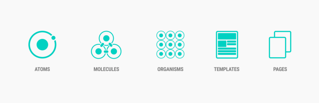
Following this pattern of thinking, on a recent project we took inspiration from Brad Frost’s: “Atomic Design”. Which takes this component based approach a step further. Brad describes each element making up a UI as either an “Atom”, “Molecule”, “Organism”, “Template” or. “Page”. These are the building blocks of every application, atomic units bond together to form molecules, which in turn combine into more complex organisms to ultimately create all matter in our universe.
Brad Frost’s “Atomic Design” Taxonomy
Enter Storybook…
So what is Storybook? Storybook is an open source tool for building UI components and pages in isolation. Sounds like exactly what we need right! Perfect for streamlining UI development, testing, and even documentation.
Storybook gives us a sandbox to display each component, one at a time, in a fixed series of states, completely decoupled from any of the internal application or business logic. And it even comes in several flavours of implementation, being made for React, Vue, Angular and even straight-up HTML. So flexible!
There are countless benefits to working this way, for us the most obvious was a faster QA process with better results. Storybook provides living, breathing evidence of how each component in a library functions. It allowed other team members and even customers to see exactly how the components look and feel in different scenarios.
Seeing all the states of the component and how it’s behaving in different situations provided valuable feedback early on in the development process, allowing for rapid iteration and the weeding out of unforeseen issues.
..So why not always work this way?
As you might’ve guessed, defining every element within a UI at the atomic level could be overkill, it can take a great deal of time and could just add to the inherent complexity of a project. There are also other systems and concepts out there that could be used to deliver a similar end result.
Ultimately there are countless ways to approach the construction of an app, and also to define its success. Creating applications in this way proved to be is a winning strategy on this project, but it may not always the right choice on another project.
Component-driven development and Storybook are a set of concepts and tools we’ll be revisiting on other projects however, as on a project we’ll share with you in more detail eventually, for a wonderful client, it’s empowered us to create something remarkable!
Now let’s answer this question honestly. When was the last time you took a deep dive into the analytics of your website? We’re going to take a bet that this is probably a bit longer than you’d like and we’re here to show you what you’re missing out on.
More often than not testing websites with real users is overlooked in the design and build of your website, and whilst this is an essential part of our offering, we know that’s not the case for all. Skipping this crucial step means that there are so many assumptions made along the way, be this your sitemap, user journeys, and the general look and feel of your website. The reality is that none of this has been validated by our users. If you can relate to this then the following is going to be of great value to you and your wider team.
Small incremental changes create a big impact
The best way to move forward is to really lean into and rely on your analytics. We can use this data to empower us and make small incremental changes to serve our users better.
We’re talking about going a level deeper than the surface-level stats that your Google Analytics dashboard provides. We want to get into the nitty gritty and see exactly how our users are navigating around the website and from this we’ll be able to discover:
How we should be making our call to action clearer, perhaps even having more of them
Understanding where users are dropping off on what we thought was an intuitive journey
Identifying where we are experiencing high bounce rates and exploring ways to improve this
Understanding the most popular search terms and how we could make this information more accessible at a higher level
Even just the examples above provide us with such great opportunities to improve our user experience, ensuring that people can find the information they want most easily and intuitively. Making these changes doesn’t always need to involve huge amounts of time and resources but if we make improvements little and often we’ll soon see the rewards.
Expanding our analytical avenues
The most popular choice when it comes to setting up analytics on your website is Google Analytics. They are the industry-leading option and there’s good reason for this but it doesn’t need to end there.
HotJar is a fantastic tool that can provide a whole host of additional data on how our users use our websites. Now typically this is a paid-for service but if you are an approved not-for-profit organisation then you can get your HotJar plan for free.
Here are just some of the features you’ll have access to:
Heatmaps that visualise our user’s behaviour on a page-by-page basis You can see exactly how far down the page your users scroll which highlights what content is getting missed. You also get to see if your call to actions are standing out enough for our users and if they are being clicked.
Recordings from your users See exactly what their sessions look like on your website. Learn exactly how long they stay on a page and where they go next.
Ask for feedback Add a simple widget to your website that allows you to collect feedback directly from your users when they are on your website.
Ongoing support from your digital partner
Having dedicated and ongoing support each month with your digital partner is the best way to ensure that your website is always evolving and your users are getting the best experience. This is why we favour long-term relationships with all our clients.
Being able to rely on a team of experts to guide you in what small changes will create a big impact is invaluable. We also understand that you may not have the time or even the skillset to know how to use Google Analytics and other tools to their potential. This ongoing time can be used to help train you in these tools if that’s something you desire or to be made aware of the opportunities the data is providing you with.
We often receive briefs from charities, non-profits, and NGOs where there’s a common theme and pain point for these organisations, and that’s branding. Either their branding is inconsistent or their website doesn’t reflect their brand.
Having a clear and consistent brand is so important, both internally as a team and externally to our users. If our branding and messaging aren’t consistent then this leaves room for mistakes to be made and for our users to not be able to truly align with our organisation and our values.
How do brand inconsistencies occur?
There can be several reasons why organisations struggle with this and we’re here to shed light on a couple of those:
There are no brand guidelines in the first place
Especially in smaller organisations, it can be very common that there are no guidelines for people to follow in the first place. This typically means that the knowledge lives in someone’s head e.g. Digital Communications Manager, and whilst this might be okay in the short-term, problems will soon arise.
What happens when they’re on annual leave or what if a tasks needs delegating to achieve a fast approaching deadline? Someone else on the team will make a decision and here’s where the inconsistencies begin. A bigger problem is when the person with all that knowledge leaves the team as their knowledge is then lost forever.
The brand is becoming outdated
Whilst the foundations of your brand may rarely change there are aspects of your brand that will continuously evolve and change over the years. Often when teams feel like their brand is becoming outdated, individuals start experimenting with new concepts and ideas internally. Whilst this is great and your brand growing can be a good thing this does also lead to further inconsistencies. These new concepts and ideas then lead the further exploration, perhaps from other team members, and before we know it the brand is misaligned.
What’s the solution?
The solution to this is actually pretty easy. Say hello to your new best friend, brand guidelines. Let’s talk about the benefits your organisation will feel from having this.
To have a strong brand you need to have brand guidelines that act as a single source of truth for the entire organisation
The goal here is that it shouldn’t matter who is trying to create a new presentation, social media content, or other marketing materials. With clear rules in place, anyone should be able to create something that’s on brand and is consistent.
Guidelines will help avoid confusion and provide clear dos and don’ts for people.
Everyone will be singing from the same hymn sheet meaning that your whole organisation knows your mission and your core values, which means you can all communicate in the same way.
What do our brand guidelines look like?
Traditionally brand guidelines would exist in a static PDF document that was designed to show people how to use your brand and then your assets (logo and fonts etc.) would be stored elsewhere e.g. Dropbox or Google Drive.
Whilst the above approach is okay, we much prefer to use methods that allow for updates to be made very easily and act more as a living breathing document. After all your brand is likely to change and evolve, so these brand guidelines need to be able to do the same.
We love using Zeroheight to document our client’s branding. This is a fantastic tool that connects up with our design software (Figma) and allows our clients to have a one-stop shop. They can find all the rules and guidelines on how to use their brand along with all of their assets in one place. Another benefit is that when the brand evolves changes can be made directly in Zeroheight without the need to update a PDF and circulate this with the team.
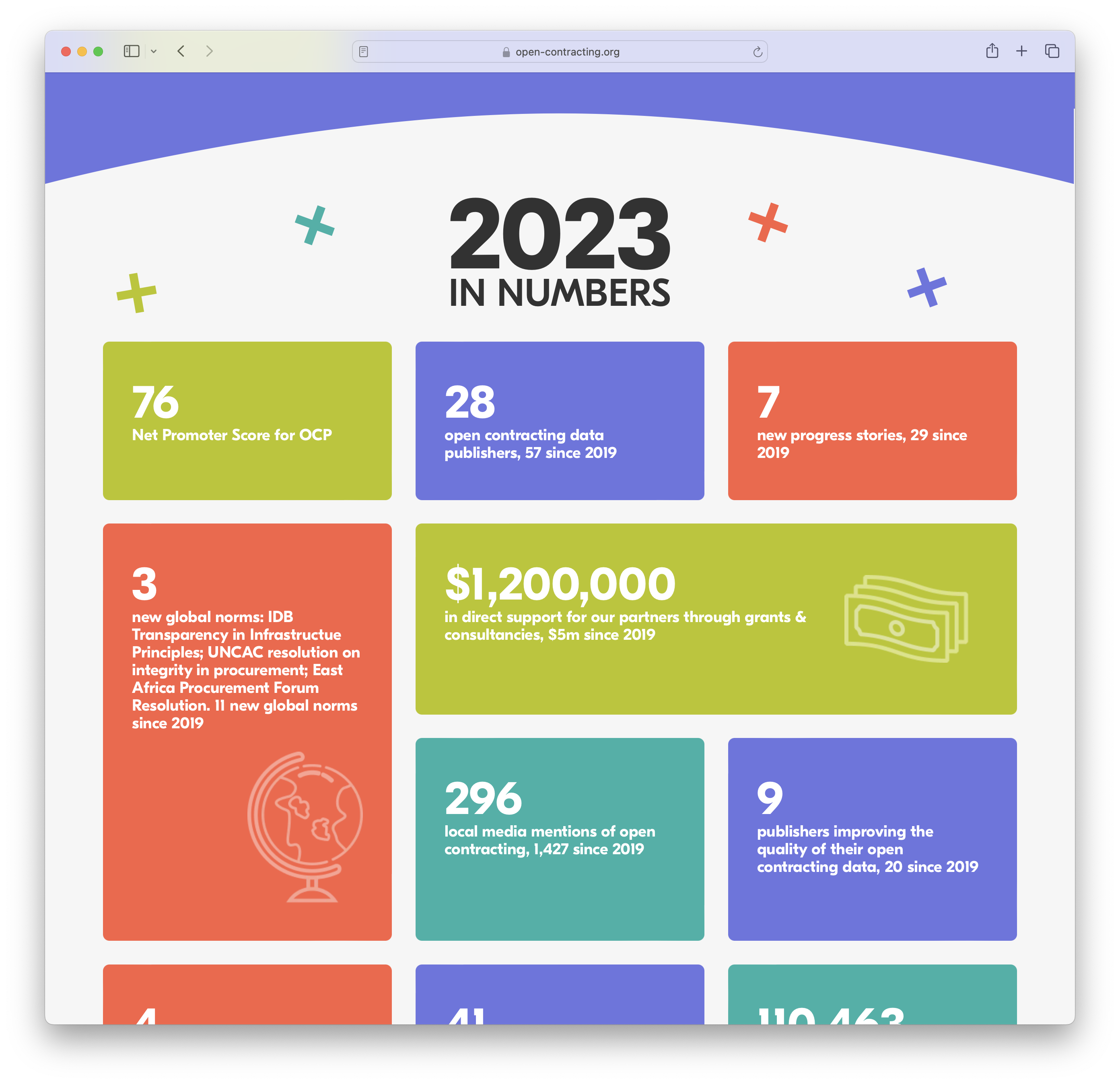
An ongoing priority for those in the non-profit sector is ensuring our websites remain fast for our users. As activities such as fundraising and campaign awareness remain ever-more important, knowing how a slow website will negatively impact engagement is useful to ensure our campaigns are as effective as possible.
-20%
drop in traffic when load times are 0.5 seconds slower
-54%
mobile visits abandoned where longer than 3 seconds to load
Improving a website’s performance is an in-depth and complicated topic, and typically it makes sense to tackle improvements that can be achieved in the quickest time whilst yielding the biggest impact, and this is where Instant.page comes in.
Instant.page is a lightweight WordPress plugin that makes navigating around a website lightning fast! It achieves this by detecting when a user is about to navigate to a new page and preloads it just before they click/tap the link. It’ll feel like magic for the user, and the quick page transition will help increase user engagement within your website.
Rewarding users with perceived performance
We call this type of improvement “perceived performance”, the page wasn’t any faster for WordPress to generate, but because the browser has pre-fetched it the user felt the benefit of an instant page transition, and you’ll benefit from higher engagement and conversion rates.
Before a user clicks on a link, they hover their mouse over that link. When a user has hovered for 65 ms there is one chance out of two that they will click on that link, so instant.page starts preloading at this moment, leaving on average over 300 ms for the page to preload.
While Instant.page is very good at solving one specific problem, it should be considered a small part of a wider performance strategy.
This mechanism isn’t going to make your page any faster to load for the first view, so users surfing in from Google, social media or a direct link will experience your website performance for what it really is, and if your pages are slow to load then this will still be an issue to overcome.
Instant.page also only pre-loads the page itself, and not any other assets a page needs, such as images, fonts, styles etc. Ensuring assets are quick to load and cached appropriately will also help greatly.
You can see here how Instant.page complements your wider performance strategy. We’re here to help if you’re unsure how well your website is performing, or if you need guidance setting and achieving performance targets, reach out to book a discovery call to level up your organisation.
Want to see how well Instant.page works? Click around this website and notice how quickly each page displays.
Being aware of our carbon impact is becoming increasingly commonplace these days, whether that’s understanding the impact between transport modes, or perhaps how much dirty energy digital infrastructure consumes.
Ensuring your organisation’s website is green not only reduces your impact, but also sends a clear statement of intent to your audience that you care about protecting the planet for future generations.
How can I tell how polluting my website is?
Two key factors contribute to the carbon footprint of your website, whether your hosting provider runs on sustainable energy sources and how well your website is optimised for performance.
If your hosting provider doesn’t have a green energy policy all is not lost, the Green Web Foundation also maintain a directory of verified green web hosting providers which highlights alternative companies to consider switching to.
What is your website’s carbon impact?
Having a green web hosting provider is a great start, but the journey through the global internet network that your website takes to reach your audience is mostly out of your control. The best way to limit your impact is to have a well-optimised website.
This means making sure your website download is as small as reasonably possible (for your use case). This can include ensuring your images are appropriately sized, compressed and served in modern formats, being cautious of 3rd party embeds (such as YouTube) and having your website respond quickly to a page request. This is a highly limited set of examples, in reality, good website performance involves a wide strategy of techniques and measurements.
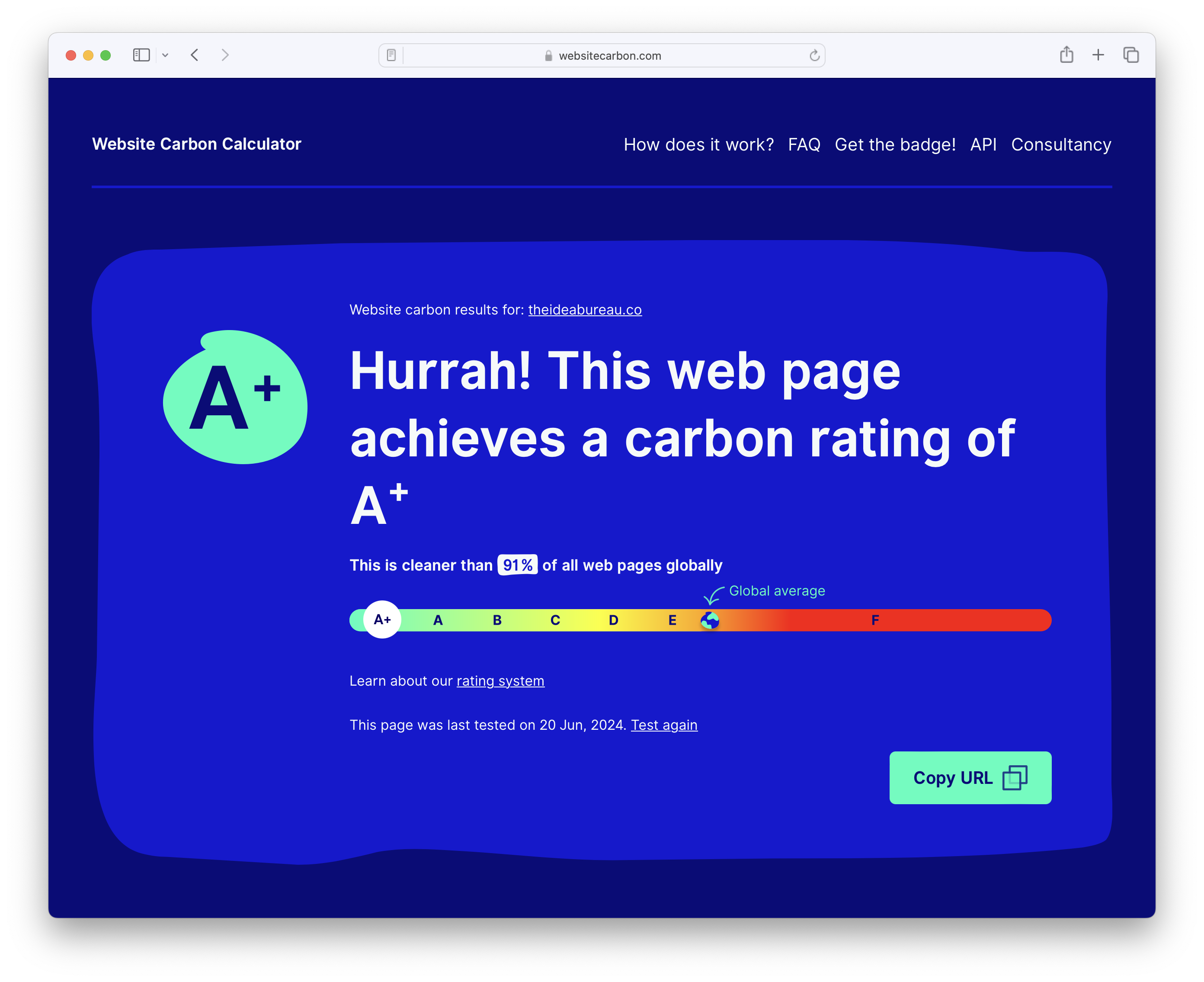
Whilst the ins and outs of website performance can get a little complicated, there are tools that can provide you with a high-level summary of the impact of your website. The Website Carbon Calculator does a great job of this, simply enter your website URL and it’ll tell you how your website’s impact stacks up against the global average, as well as how much CO2 each page load produces and what that equates to in real-world terms.
Why does this matter?
The Peoples’ Climate Vote, conducted by the United Nations with over 1.2 million responses, shows that the majority of people agree that climate change is an emergency. Your audience is getting more clued up on carbon reduction and this will surely become a higher priority for them as time goes on.
As is sometimes the case, improvements in one area will also benefit others. We mentioned how web performance is linked to carbon impact, but good web performance also makes for better user experiences and engagement. Reducing your website impact will help cut down operational costs too, making the most with fewer resources so your digital operations aren’t excessive for your needs.
The wonderful thing about carbon reduction on the web is that results scale. Big or small improvements can accumulate to make significant impacts when scaled up to 10k, 100k or 1 million page views.
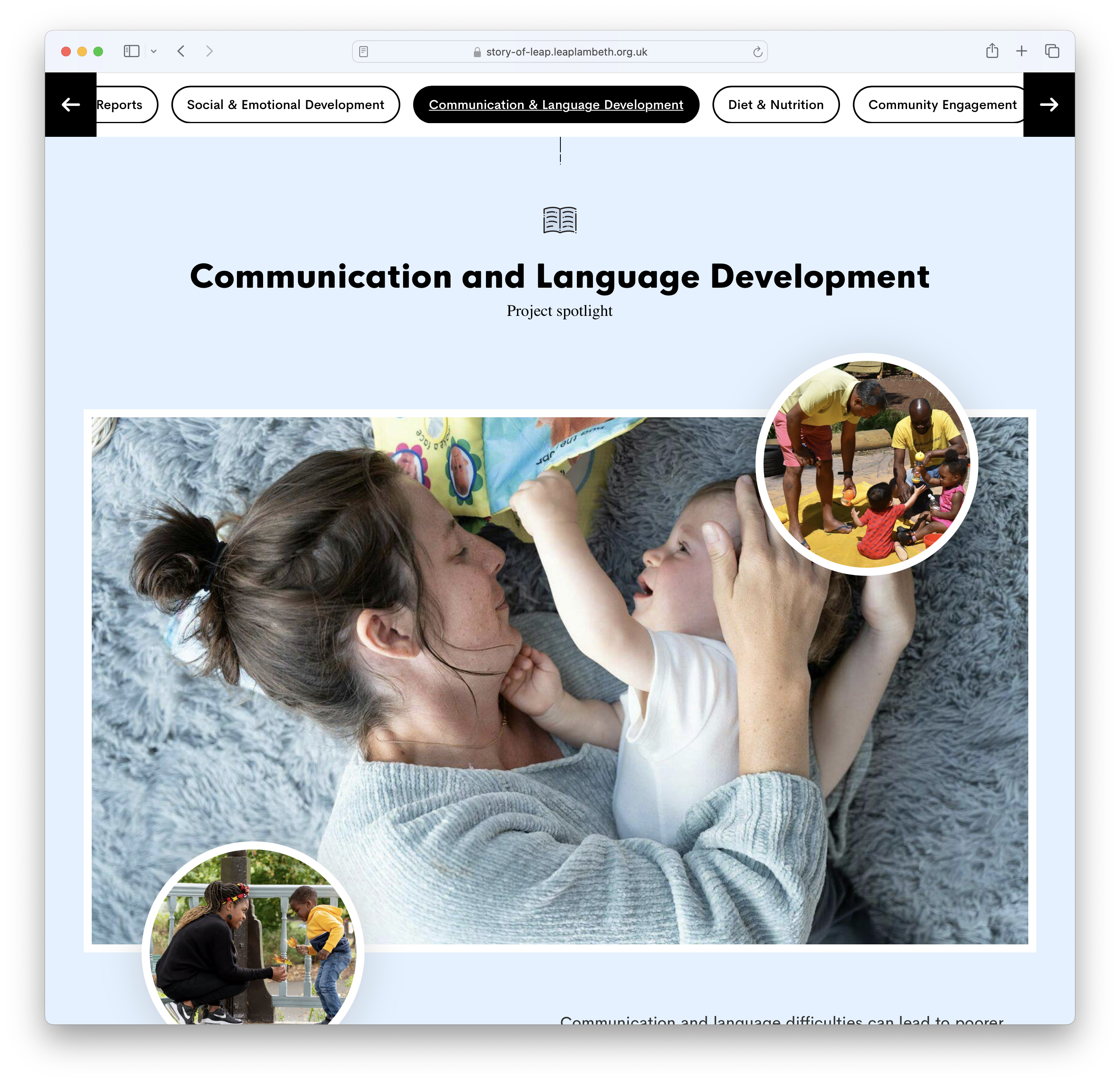
We are keen advocates for an open, accessible and beautiful web here at The Idea Bureau, it’s something to be celebrated and embraced when it comes to our collective online communications. We see in the not-for-profit sector that teams are comfortable leaning into this for their websites, but seemingly not so much for larger pieces, such as impact reports.
Typically organisations will create these documents as PDFs, a decision rooted in when printed documents were more commonplace, as that’s becoming less of a concern for most let’s explore the benefits of a web-based approach to your impact reports.
Superior reading experience on any device
Sure a PDF is a known quantity, a fixed document that’ll provide the same experience across all devices, but at the expense of the reading experience for the user. For many of our non-profit partners, we’re seeing mobile and tablet use continue to gain, if not surpass desktop traffic, and we know that devices vary wildly when it comes to size, orientation and quality, so a one-size-fits-all approach doesn’t work anymore.
Taking full advantage of the responsive web means our documents can react to the user’s browser and device, tailoring their reading experience much more specifically to them, and in a far superior way than trying to read an A4 PDF on a mobile phone.
Image quality can also be controlled to be much more considerate of the end-user, whether that’s serving smaller images to someone on a lower-quality device to reduce download time, or allowing a high-quality device to download higher-resolution images to bring maximum impact, it works for everyone.
Naturally, we can also include interactive elements, such as embedded videos, charts, surveys and design animation.
Accessibility enhanced for all
Web-based documents can make the most of browser accessibility features allowing more users to engage with your content. In addition, search engines can take advantage of the page structure to make it available to your users for searching, something that’s not as effective with PDF documents.
PDFs will typically be relatively large documents, and the entire document must be downloaded at once, whereas the loading of images and embedded media on the web can be delayed until it’s likely to be viewed, reducing the amount of the website downloaded and making the initial experience far quicker.
Improving engagement and gaining insights
Tracking engagement on a PDF will stop when the file is downloaded, it’d be next to impossible to understand how many repeat views it gets, how long someone spends reading the report, and what sections they focus on the most. This missing context would be beneficial for making future decisions, and of course, these are metrics we can keep on top of with analytics and behaviour analysis tools on the web.
The web page will also remain fully in your control, meaning adjustments and updates can all be easily made so all future views see the correct content, something that is out of your control when a user downloads an offline copy of a PDF, and perhaps shares with a friend.
Web pages are far easier to share also, and when doing so a rich preview will be displayed alongside the link on social media and messaging apps.
Whilst not impossible with PDFs, specific calls to action will be more effective on the web, incorporating the report into the wider website.
What if creating a full web report is not feasible?
We appreciate that creating a full web version of an impact report may not always be feasible, whilst tools such as WordPress’ Gutenberg make it easy to construct a report based on blocks where it’s easy to create and maintain, a good alternative is a web-based summary of the document, where you can highlight and celebrate the key points, giving the user a reason to read further.
No matter what the best option is for your organisation, we can help make sense of the benefits and input needed to make your reports stand out.
Let’s make your next impact report something to shout about


